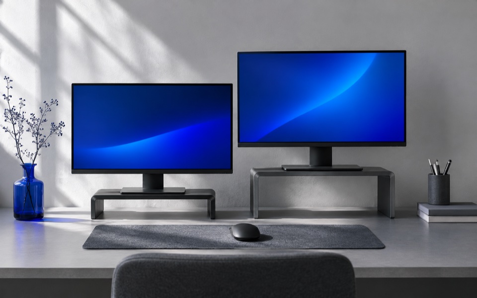
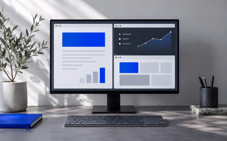
A legacy app may look crisp on a 100 percent display and soft the moment you move it to a 150 percent display. First compare its menus or a line of plain text with the same kind of text in a second app. Check whether the blur is in the menu labels or only in the image. App zoom can change the image without touching the menus.
Keep a record of which display settings you started with. Bring both screens to their recommended resolution where practical, then note scale separately. In Windows multiple display settings, select the relevant screen before reviewing its scale and resolution. Keep the app's own zoom fixed during the comparison.
Follow the same window
- Open a line of body text in the problem app. Examine the menu and title area along with the text.
- Drag the same window fully onto the other screen. Wait for it to redraw. Compare both the letter edges and the size of the buttons.
- Close and reopen the app on that screen. Repeat the check and record where the window opens.
- If your workflow allows, briefly match the scale on both displays and repeat step two. Return to the settings you recorded after the test.
Windows can stretch the rendered pixels of an app that always draws for a 100 percent scale. Microsoft calls this DPI-unaware behavior. A system-DPI-aware app typically gets the primary screen's DPI at sign-in. Windows can still stretch its bitmap on screens set to a different scale. An app that implements per-monitor DPI handling can update when it moves. Reopening the app is a test, since the awareness mode can remain tied to the session.
| Result | Next action |
|---|---|
| All apps and the desktop look blurry on one display | Verify that screen's resolution and display settings before changing app options |
| One app softens after crossing and improves when both scales match | Check app updates and use the screen where its controls render best |
| Only the contents soften and the menus stay crisp | Revisit document zoom, image resolution or the file preview |
| The window remains too small even with crisp edges | Adjust zoom or use the display scale that keeps the controls usable |
On macOS, start with the affected screen's Displays resolution options and repeat the same text comparison. The Windows DPI awareness categories describe Windows software. Switch back to the recorded resolution after the comparison, then choose the setting that makes menus and document text readable at your usual viewing distance.
Start with a control sample on the display
Choose a window with text you recognise, such as a menu in the problem app and a small document in another program. Open both on the first display. Note the monitor resolution and scaling settings, plus the zoom used in each app. Move both windows to the same point on the second display and check their menus as well as their content. If only a photograph or document preview becomes soft, restore the same zoom before concluding there is a display difference.
Look at the desktop and a system settings window too. If everything is visibly soft on one monitor, check the chosen resolution and input settings. Try the display's recommended resolution where applicable and keep the original setting noted. Change a single option and repeat the comparison. If only the legacy tool goes soft at that scale, keep the monitor's ordinary setting while deciding how to use or update the tool.
Suppose a drawing app opens on a 100 percent display and places its menus at a regular size. It softens when moved to a 150 percent display, while a second program stays crisp and draws larger labels. That pattern is consistent with different behavior under DPI scaling on Windows. Try opening the drawing app directly on the second monitor or moving it back and forth. Record which programs looked different. The diagnosis does not establish the application's exact awareness mode without vendor or system evidence.
Separate the image from the viewer
Compare an ordinary text file and a small reference image on the same display. A crisp toolbar and soft image may indicate zooming or a lower-resolution preview. Load the original in a second viewer at a comparable size and inspect the same lines. If the same picture area is soft in both apps while the menus are sharp, check the source and interpolation first. If the entire app changes when crossing displays, compare the operating system scaling and program behavior.
On Mac, pick the affected display and review its current resolution. Compare the same text in the problem app and an ordinary system window. If a readability problem is mainly text size, choose the setting that gives a clear useful size while keeping the app's content acceptable. Keep the first setting so you can revert a bad experiment. An older Windows app's DPI behavior does not predict how the corresponding Mac app will draw.
Choose a small change you can undo
If you can match the display scales temporarily, use that as a test. If the app becomes sharp, restore the values that keep everyday text readable across both screens and see whether moving the app or using an updated version is practical. If it still looks bad, compare the control app and inspect what source or resolution is actually being used on that screen. Avoid changing several app compatibility and display flags at once.
Test a common action after any change. Open a menu, read an ordinary paragraph and find one small field you use often. If the result looks crisp but the field is too small to use, log readability separately from sharpness. Keep the operating system, display, scale and app information with a report to the vendor.
If moving windows in the first place is difficult, use the two-monitor pointer test to verify the arrangement. After changing the dock, monitor or app version, compare the same app and control text again. This gives you a usable reference when deciding whether a later result comes from a different display or the program itself.